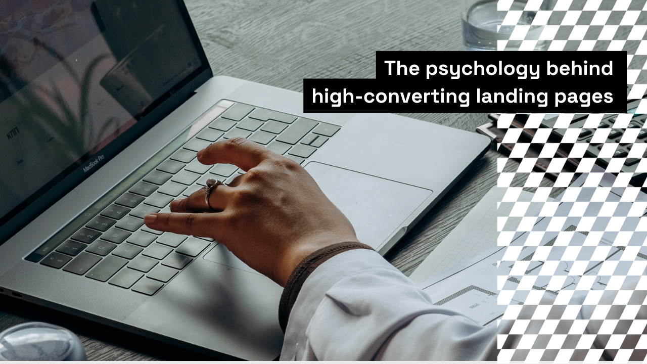
Landing pages are the unsung heroes of conversions in digital marketing. They frequently determine whether a tourist sticks around or leaves. However, what constitutes a genuinely good landing page? The study of behavioural psychology provides insightful information that goes beyond copy and design. Your landing pages’ impact can be greatly increased by having a thorough understanding of users’ thoughts, feelings, and behaviours.
This blog post will discuss how to create landing pages that convert well by utilising fundamental behavioural psychology concepts.
1. The Power of First Impressions: Leveraging the Halo Effect
Within milliseconds of landing on your page, a visitor forms an impression. Their entire experience is influenced by this first impression, a phenomenon called the Halo Effect. An air of competence and reliability is produced by a neat, polished, and eye-catching design.
How to Use It
• Employ expert branding components and top-notch images.
• At the top of the page, clearly display any important awards or benefits.
•Make sure your title is value-driven, succinct, and unambiguous.
For instance, use something like “Achieve 2x Growth in Half the Time with Our Solution” rather than “Welcome to Our Product.”
2. Harnessing Social Proof for Credibility
According to behavioural psychology, social proof is the foundation for the idea that people consider other people when making judgements. Reviews, case studies, and testimonials are effective ways to foster confidence and sway judgements.
How to Use It
• Place client testimonials or success stories close to your call to action (CTA).
• Include the logos of reputable companies you have collaborated with.
• Display user-generated content or media mentions that are “as seen on.”
For instance, testimonials such as “I lost 10 pounds in 2 months using this app—best decision I made!” could be included on a landing page for a fitness app.
3. The Scarcity Effect: Creating a Sense of Urgency
When people believe there is a limited chance, they are more likely to take action. The Scarcity Effect is a psychological trigger that can lead to rash judgements.
How to Use It
• For limited-time deals, use countdown timers.
• Emphasise terms such as “Offer expires at midnight” or “Only 3 spots left!”
• Show that there are only a few spots available for special offers.
An e-commerce landing page might say, for instance, “Hurry! There are just two things left in stock.
4. Cognitive Ease: Simplicity Wins
Cognitive ease refers to the ease with which information may be processed by the human brain. Users are more likely to convert when they can easily explore and comprehend your landing page.
How to Use It
• Make use of a simple design with lots of white space.
• Divide the content into bullet points and keep the text to the most important details.
• To direct activities, use well-known symbols or icons (such as a shopping cart icon for “Buy Now”).
A SaaS landing page, for example, might only have three steps: “1. Create an account, 2. Personalise your dashboard, 3. Begin saving time right now.”
5. Reciprocity: The Art of Giving First
Reciprocity is the idea that when people get something, they feel obliged to repay the favour. Building a good rapport with your visitors can be achieved by providing free value up front.
How to Use It
• Provide an exclusive guide, digital eBook, or free trial.
• Offer new customers free shipping or a discount code.
• Employ expressions such as “We made this free tool specifically for you.”
For instance, in return for an email address, a marketing agency may provide a complimentary “SEO Audit Checklist.”
6. The Paradox of Choice: Limit Decision Fatigue
The Paradox of Choice is the idea that while having too many alternatives can empower people, it can also overwhelm them and cause them to do nothing.
How to Use It
• Concentrate on a single main call to action every page, like “Sign Up Now” or “Learn More.”
• Keep the amount of form fields to the absolute minimum that is necessary.
• Provide distinct, binary options, such as “Basic Plan” and “Pro Plan.”
For example, the buttons “Try Free” and “Enrol Now” might be prominently displayed on the landing page of an online course.
7. Anchoring: Guide User Perception
When people use the first piece of information they come across as a point of reference, this is known as anchoring. This may influence how they view other possibilities.
How to Use It
• Show the discounted price next to the original price (for example, “Rs.99, now only Rs.49”).
• Make use of tiered pricing, so the costliest option is displayed first.
• As the “anchor,” highlight the main advantages of your main offer.
For instance, “Rs.150/month (Standard Plan)” can be the first choice listed by a subscription service, followed by “Rs.100/month (Basic Plan).”
8. Loss Aversion: Highlight What They’ll Miss
According to behavioural psychology, people are more afraid of losing something than they are of getting it. This idea, known as loss aversion, has the potential to be a strong motivator.
How to Use It
Benefits should be framed as preventing losses. “Don’t Miss Out on 20% Savings,” for instance.
• Make use of phrases like “Avoid Missing Deadlines” or “Never Run Out of Ideas Again.”
• To keep users, provide trial periods with expiration dates.
The phrase “Switch now to avoid missing critical updates” could be emphasised by a software firm.
9. Emotional Appeals: Connect on a Deeper Level
Since humans are emotional creatures, emotions frequently influence decisions more than reason. Creating information that resonates on an emotional level helps strengthen bonds.
How to Use It
• Tell a tale to demonstrate how your product addresses actual issues.
• Emphasise desired results, like “Feel more confident in your career.”
• Include pictures of contented, joyful clients.
A charity landing page might, for example, tell a tale of how a person’s life was transformed by donations.
10. The Mere Exposure Effect: Familiarity Breeds Trust
The Mere Exposure Effect states that people are more likely to trust things they are familiar with.
How to Use It
Ensure that your branding and messaging are consistent across all platforms.
• Before visitors arrive at the landing page, use retargeting advertisements to reaffirm familiarity.
• Throughout the page, draw attention to easily identifiable components, such as your catchphrase or logo.
An online business might, for instance, use the tagline “Quality You Trust, Delivered Fast” and a consistent colour palette.
Conclusion
A multitude of strategies from behavioural psychology can be used to optimise landing pages and turn them into conversion-boosting machines. You may create experiences that fit users’ thoughts and behaviours by utilising concepts like social proof, scarcity, and emotional appeals.
In a world when decisions are made in a split second and first impressions count, a landing page based on psychological insights is not only useful, but essential. Therefore, keep in mind that a little psychology goes a long way the next time you create a landing page.