When we consider developing websites that capture people and increase conversions, features such as layout, content, and functionality frequently spring to mind. One significant but often overlooked part of design is colour psychology. Colours are more than just visual aesthetics; they elicit emotions, shape perceptions, and subtly impact user decisions.
Understanding how colours influence behaviour is essential for UI/UX designers who want to develop effective and compelling digital experiences. In this article, we’ll look at the science underlying colour psychology, its importance in online design, and how to use it to develop conversion-optimized websites.
Why Colours Matter in UI/UX Design
Colour is profoundly embedded in human psychology. They elicit emotional responses, shift moods, and activate cognitive associations. Here’s why these matters in UI/UX design:
- First Impressions
According to research, consumers develop their first impressions of a website within 50 milliseconds. Colours play an important role in this snap judgement. - Emotional Triggers
Certain emotions are evoked by different colours; for example, red inspires urgency, green symbolises growth, and blue instils trust. Enhancing user engagement can be achieved by matching these emotional cues with your brand’s objectives. - Guiding User Behaviour
Colours have the power to draw attention, draw attention to calls to action (CTAs), and affect how decisions are made. For instance, a “Buy Now” button that is vividly coloured tends to receive more clicks than one that is muted. - Brand Recognition
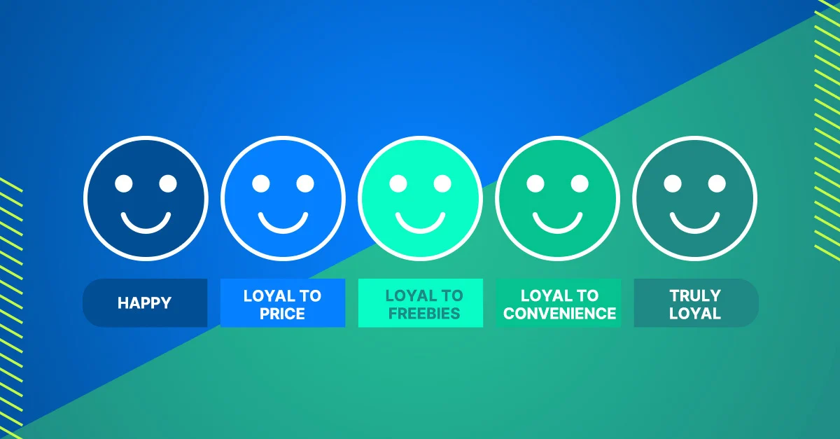
Using brand colours consistently boosts awareness by 80%. Users are encouraged to interact with the website because of the confidence and familiarity this consistency builds.
The Psychology of Individual Colours
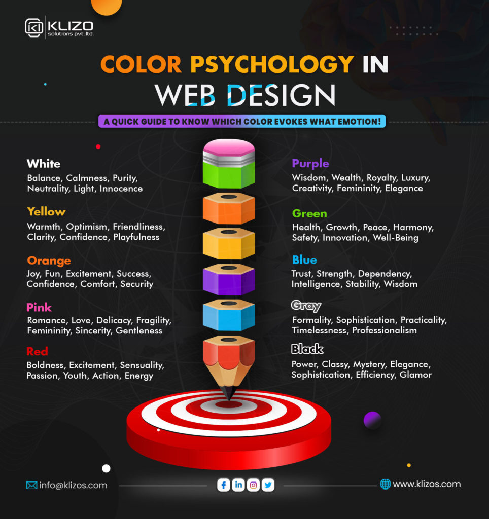
1. Red: Energy and Urgency
• Increases enthusiasm, desire, and urgency.
• Recommended use cases include sale banners, clearance deals, and urgent CTAs.
• Caution: Excessive use may create anxiety or violence.
2. Blue: Trust and Calmness
• Promotes trust, dependability, and security.
• Top use cases include financial services, healthcare, and technology websites.
• Excessive use may appear cold and indifferent.
3. Green: Growth and Harmony
• Psychological effects linked to nature, growth, and wellness.
• Best use cases include environmental companies, wellness platforms, and finance apps (representing wealth).
4. Yellow: Optimism and Attention
• Psychological Effects: Exudes joy, cosiness, and vivacious vitality.
• Best Use Cases: Emphasising key components, encouraging positivism, and highlighting features.
• Caution: Excessive use can lead to tension or a wary attitude.
5. Black: Sophistication and Authority
• Psychological Effects: Stands for wealth, influence, and refinement.
• Fashion, minimalist designs, and high-end goods are the best use cases.
• Caution: Excessive use may feel depressing or overpowering.
6. White: Simplicity and Purity
• Psychological Effects: Shows simplicity, openness, and cleanliness.
• Clear designs, negative space, and backgrounds are the best use cases.
• Caution: Too much use could make it seem bland or sterile.
7. Orange: Enthusiasm and Action
• Psychological Impact: Promotes vigour, excitement, and playfulness.
• Secondary CTAs, interactive components, and entertainment platforms are the best use cases.
8. Purple: Creativity and Royalty
• Psychological Effects: Encourages spirituality, creativity, and luxury.
• The best use cases are creative tools, education platforms, and beauty brands.
Key Principles of Using Colours in UI/UX Design
1. Understand Your Audience
Colour perception varies throughout cultures and demographic groups. For example: Younger audiences may favour vivid, lively colours, while older audiences may favour subdued, elegant tones; white is linked with purity in Western cultures and with mourning in some Eastern cultures.
To match your colour selections with the tastes of your audience, do user research.
2. Use Contrast to Enhance Readability
For readability, there must be a strong contrast between the text and background. You can make sure your design complies with accessibility guidelines by using tools like WebAIM’s Contrast Checker.
3. Apply the 60-30-10 Rule
This design principle recommends utilising 60% as the main colour in backdrops or significant portions.
• Use 30% as a secondary colour in navigation and content.
• Use 10% as an accent colour for CTAs and highlights.
4. Leverage Negative Space
White or neutral negative space can balance out strong colours, making the design less overwhelming and attracting attention to crucial aspects.
5. Test Colour Combinations
Colour schemes that appear great on paper may not transition well to digital devices. Conduct A/B testing to determine which combinations are most popular with users.
Real-World Examples of Effective Colour Use in Web Design
1) Spotify
Spotify’s primary brand colour is a vibrant green, which represents vitality and expansion. The dark background makes the content stand out, while the white font gives good readability.
2) Dropbox
Dropbox’s user interface uses calming blues to emphasise trust and dependability. Their basic design promotes clarity and attention.
3) Airbnb
Airbnb’s usage of coral pink evokes feelings of warmth, friendliness, and creativity, which is ideally aligned with the company’s brand promise of hospitality and connection.
4) Amazon
Amazon’s usage of orange for CTAs like “Add to Cart” or “Buy Now” instils a sense of urgency and encourages fast action.
Common Mistakes to Avoid
1. Ignoring accessibility.
Failure to include colourblind users or those with visual impairments may alienate a substantial section of your target audience. Always test designs for inclusiveness.
2. Overload with colours
Using too many colours can mislead customers and dilute your brand’s message. Maintain a cohesive colour scheme.
3. Misaligned colours and brand personality.
Make sure your colours are consistent with the tone of your brand. For example, employing bright, lively colours on a law firm’s website may reduce its trustworthiness.
Steps to Choose the Perfect Colour Palette for Your Website
1. Define your brand personality.
Is your brand playful or professional? Luxurious or approachable? Your brand personality will influence your primary colour choices.
2. Research competitor palettes.
Analyse competition to differentiate yourself while being relevant in your industry.
3. Use tools to experiment.
Adobe Colour, Coolors, and Canva’s Colour Palette Generator are all useful tools for creating harmonious palettes.
4. Optimise your colour palette with A/B testing and user feedback.
Future Trends in Colour Psychology for UI/UX
1. Gradients and dynamic colours.
Modern designs are moving beyond flat colours and adding gradients to add depth and brightness.
2. Dark mode optimisation
Dark mode has become popular due to its aesthetic and energy-saving benefits. Designing palettes for both light and dark modes is increasingly necessary.
3. Personalisation.
AI techniques enable personalised colour palettes to enhance user experiences.
Conclusion
Colours in UI/UX design are more than just cosmetic elements; they are strategic tools that impact user behaviour, form perceptions, and motivate conversions. Understanding colour psychology and applying it wisely allows designers to create visually appealing and highly functioning websites that resonate with users.
Every colour, whether blue, crimson, or black, conveys a tale. The goal is to ensure that your colour choices are consistent with your brand statement and your target audience’s expectations.
Finally, developing websites that convert is more than simply looking good; it’s about creating experiences that connect emotionally, guide intuitively, and give value flawlessly.